Samir Black
Project Brief
To provide Samir Black with a sleek redesign for his personal portfolio
About the Project
Time Window: 3 month project
Roles in project: UI designer
Tools: Figma, Pen & paper, Wordpress
Scope of work: To provide Samir Black with a sleek redesign so he can create blog posts detailing changes in the cybersecurity industry as a cybersecurity sole proprietor
Prior to this project, I had a professional acquaintance with Samir Black, a cybersecurity expert seeking to enhance his personal portfolio website. The goal was to create a platform that would allow him to share experiential insights and thought leadership through blog posts, while providing clients with a clear and intuitive user experience. Samir approached me to help redesign the site, focusing on improving usability, navigation, and visual hierarchy. Together, we conducted an assessment of the existing site, identified pain points, and implemented a streamlined design that elevated content discoverability, improved responsiveness across devices, and aligned the site’s aesthetic with his professional brand. Due to time constraints, Samir needed to hire a designer to help him with his redesign and marketing for his business.
Initial Research
As I prepared to start the redesign of Samir’s portfolio, I noticed initially that his website had some entire sections missing. Additionally, his website was not as descriptive to potential clients who knew nothing about cybersecurity. My initial observations of his website included the following:
Lack of primary and second navgiation
A personal logo
An “About” Section
A blog page
Additionally, the original website had cluttered information, inconsistent layout, and did not accurately reflect Samir’s professional credibility. To change this, I began by creating a new suggested navigation, user flow, sketches, and a couple of wireframes.
Navigation
The suggested navgiation that I had for Samir’s website was created through a tree map. Initially, the website did not any primary or secondary navigation, so I created a primary navigation for the website with the possibility of creating secondary navigation in the future. Samir emphasized the need for a blog to emphasize his experiential knowledge of cybersecurity, fintech, and consulting. Additionally, he wanted to include an option to connect with him to make an appointment for service.

User Flow
Designing the primary navigation gave me a track to create a user flow that would give me a more specific idea of what users would need to use Samir’s website effectively, efficiently, and intuitively. I included 3 different tracks for users to immediately decide on an appointment, reading a blog post, or to learn more about who Samir is before any users book an appointment with him for service.


Initial Wireframes
Since Samir’s website redesign did not involve the entire UX research and design process, I wasn’t designing the new website from scratch. I used Wordpress to redesign the website and was confined to the themes and color schemes provided. However, I did use Figma to create some initial wireframes to sketch out my design. This was to help both myself and Samir have an idea of how the final product was going to turn out. The initial picture was a preliminary design idea from Wordpress, mixed with some additional elements in black-and-white from Figma. The rest are black-and-white wireframes designed in Figma.


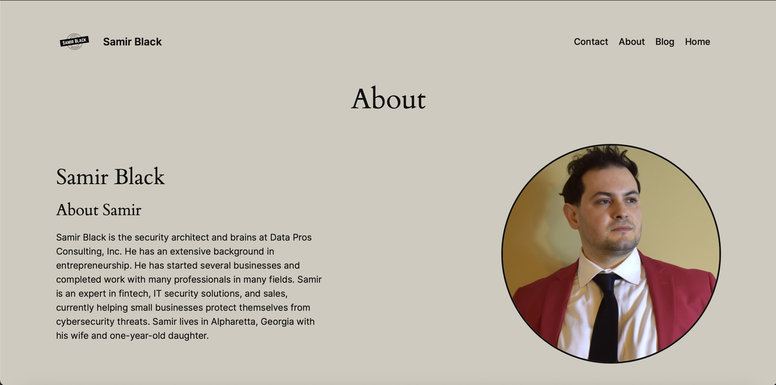
Final Design
After designing the initial wireframes, I had an outline for what Samir’s website would look like in its final iteration. I ran through a couple of theme designs and color schemes before I landed on the final design. I wanted to use colors that represented security and stability, since Samir’s entire business revolves around ensuring his clients are protected and done so with an extra attentiveness and awareness for detail. I ended up using a mix of brown, gray, white, and black. Additionally, I designed a new logo for solely Samir as an individual consultant, not him as part of the entity / small business Data Pros Consulting. I kept WCAG 2.0 accessibility guidelines in mind to make sure those with vision differences would be able to see the text and pictures clearly.

Walkthrough
After the website went live, Samir and I noticed a positive change in viewership. Within two-to-three weeks, we noticed that Samir’s intended audience was headed in a positive direction. There was a 109% increase in visitors, and a 60% increase in views.
Next Steps
I learned so much during this project! Samir was a great teacher who was someone already familiar with the UX research and design process. He also was impressed with the redesigned interface on his portfolio. However, he did suggest several updates, should he decide to return to the project in the future. As with any project, there is always more work to be completed to enhance any user experience. I have listed those next steps below.
Make the CTA (Call-to-action) buttons on the landing page more intuitive
Conduct usability testing on the website with some of Samir’s clients for additional data
Add a drop-down menu to each of the primary navigation tabs

Continue updating the brand colors and assure they meet WCAG guidelines for accessibility.
Add KPI’s to better measure engagement with intended audience
Add additional pages showcasing individual case studies of Samir’s work