

Seven Hills Running Shop
Project Brief
To provide Seven Hills Running Shop with a sleek new redesign, plus a new e-commerce feature
About the Project
Time window: 2.5 week sprint
Roles in project: UX generalist, UI designer, UX researcher, interviewer
Tools used: Zoom, Figma, Canva, pen & paper, tablet
I came across the Seven Hills Running Shop website while doing some research for a UX project. As an avid runner, the name and idea caught my attention. Once I took a glance at the website, I noticed a number of various UX concerns and broken links. Upon doing further research, I realized that there was a need to redesign this website. I was not a part of a team formally working with Seven Hills Running Shop, but merely an independent designer.
Initial Research
To start off my research, I did some investigating into other local running store websites in the Atlanta, Georgia area, since I am based primarily there. What I discovered was that most independent or franchise-operated running stores have functional websites and a robust product selection. While Seven Hills Running Shop also had a wide variety of products to choose from, it had a number of broken links or missing pages. From this point, I realized that I needed to conduct usability testing and user interviews to determine how large of a scope the redesign of the Seven Hills website would be. During those interviews, I asked the users to also fill out a survey regarding how they believe the website should be organized.
Additionally, compared to possible competitors, here’s how Seven Hills Running Shop held up:
3-D Foot Fitting
Social Media Presence
Race Host
Bike Services
Locations in different states
1-on-1 specialization
Blog


❌
💪🏼
💪🏼
❌
💪🏼
💪🏼
💪🏼
💪🏼

💪🏼
💪🏼
💪🏼
❌
❌
❌
💪🏼
💪🏼
❌
💪🏼
💪🏼
💪🏼
❌
💪🏼
💪🏼
❌
❌
💪🏼
💪🏼
❌
Once I completed the competitive analysis, I conducted 6 initial interviews with usability testing, which provided me with the following quantitative data:
Each user took 8 minutes and 16 seconds on average to complete the task of purchasing a pair of shoes on the website
4 / 15 errors (misclicks) were made in the process
5/6 of the users completed the task on the first attempt
Other observations included:
Original website had broken or missing links, including links for an FAQ page and a customer service page
Certain brands, such as Brooks, were not available for online purchase
Buttons and text were too small
Branding for the website was confusing
Some links took users to different websites entirely, which was jarring
Based on these observations and other qualitative data, I developed 8 distinct research categories to organize my findings:

These observations led into developing these interview takeaways:
Problem Statement and “How Might We’s…?”
These user interview takeaways and research categories from my interviews, usability testing, and takeaways led me to develop a problem statement and “How Might We” questions to narrow the scope of the project.
“Users need a running store that provides an efficient online shopping process so that they have easy access to a wide variety of high-quality products.”
How might we…..
….provide a running store website with efficient online shopping features?
….improve our lines of product for our customers?
….help our users find shoes to fit their needs?
….cater to the training level of our users?
From here, I developed a persona for this project that would speak for all of the needs, desires, and concerns of the runners I interviewed. How would they react in a real-world scenario when the Seven Hills website was redesigned, but the heart of the company remained intact?

Persona
Martin Evansen
📍 Atlanta, GA
🙎🏻♂️️ 28-year-old male
👨👩👦 Single, lives in the city
“I need my running store to be timely and have a variety of fitness resources and products.”
“I run 4-5 times a week in the midst of a busy schedule.”
“I get frustrated with inefficiency and poor athletic store experiences.”
“My goal is to stay physically fit and have high-quality shoes
Martin’s Retrospective Journey
Since the persona of Martin Evansen lived in the Seattle, Washington area before moving to Atlanta, he loved the customer care and devotion to the sport of running that Seven Hills Running Shop put into their work. However, I realized that based on the research, Martin’s primary problem was getting a high-quality pair of running shoes for consistent workouts in a decent amount of time. I developed a journey map looking back at Seven Hills’ struggle to provide him with a meaningful and efficient experience using the website to purchase a pair of running shoes
Step 1: Need new shoes
Thoughts
“I hope to start training within the next couple of weeks”
Step 2: Start shopping
Thoughts
“Where are the shoes?
Why are the links broken?”

Step 3: Find desired shoes
Thoughts
“I am frustrated and annoyed with the lack of working links.”
Step 4: Choose new shoes
Thoughts
“I am stressed out by with the lack of online selection of shoe brands.”
Step 5: Checkout online
Thoughts
“There is free shipping if I spend over $100.”

Happy
Confused
Disappointed
Stressed
Neutral
Site Map
As mentioned earlier, the users I interviewed completed a survey to provide some feedback on how the website should be structured. Due to the navigation of the current Seven Hills website not being as intuitive or functional, I included the updated navigation for the website as a part of the redesign. The revised site map for the Seven Hills Running Shop website is displayed below.
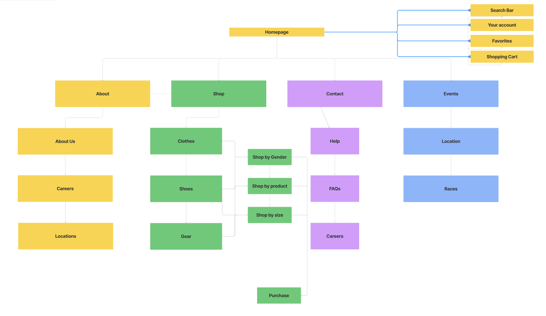
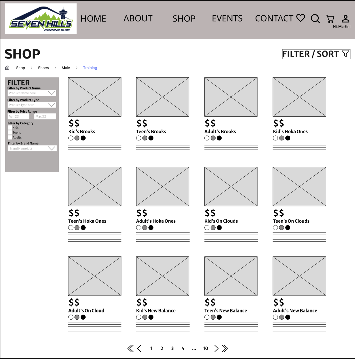
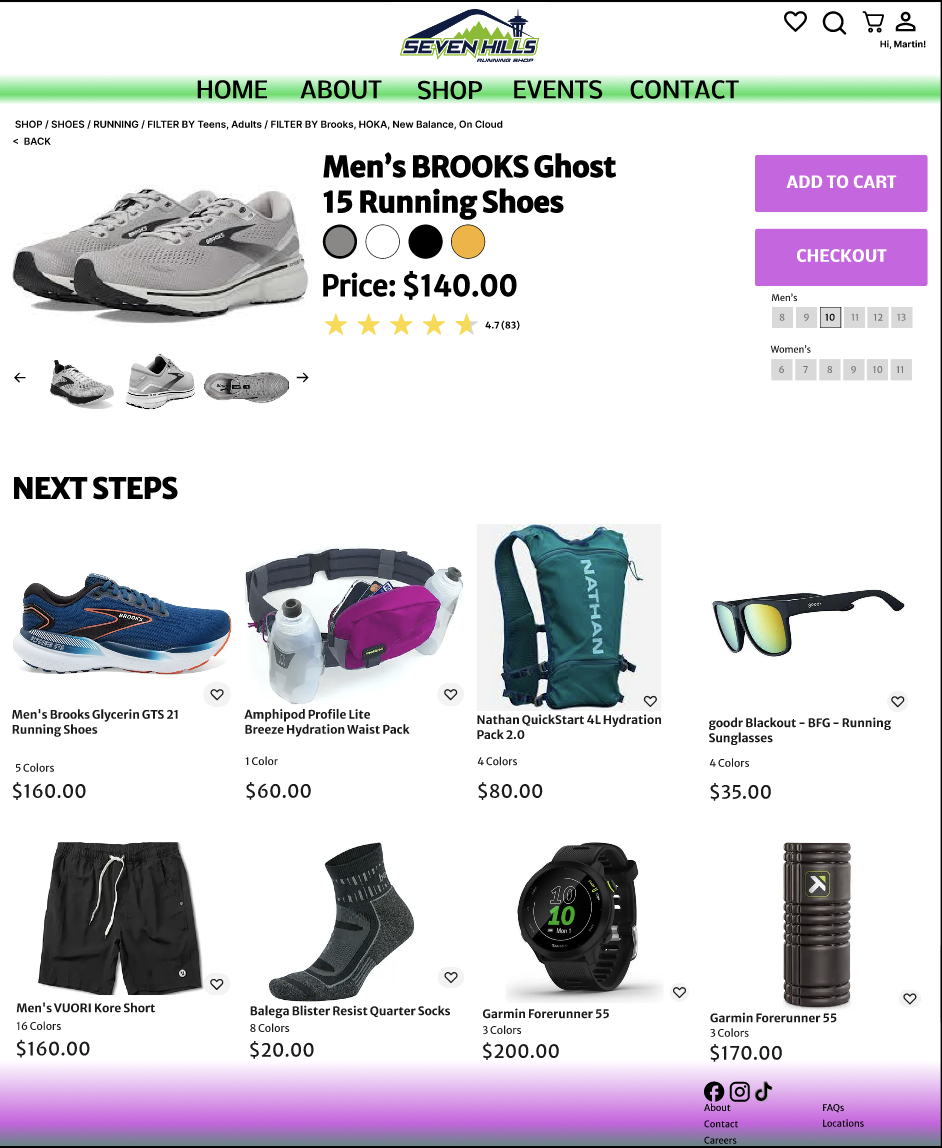
As previously mentioned, I made sure there were working links with frequently asked questions and a functional customer service page that is under the contact icon. Considering the fact that users also had a difficult time selecting product choices to compare and contrast, I made sure to add filters per their requests to allow more product selection, even if they don’t see exactly what they are looking for when they first navigate to the shopping page. This way, if a future customer sees a shoe they want to buy, they can easily use the filters feature!
From the site map, there is now a clearer picture from where the project needs to go. Martin’s choices provide a clear path to accomplishing his goal of purchasing a new pair of shoes from the Seven Hills Running Shop website. I developed a clear path for Martin to take with the updated site map and journey map, focusing closely on the specific actions Martin has to take as he navigates the revised website to purchase his desired pair of shoes, in this case, a pair of Brooks.

User Flow
Scenario: Martin needs to buy new running shoes to train for a marathon he’s running in 9 months.

Sketches
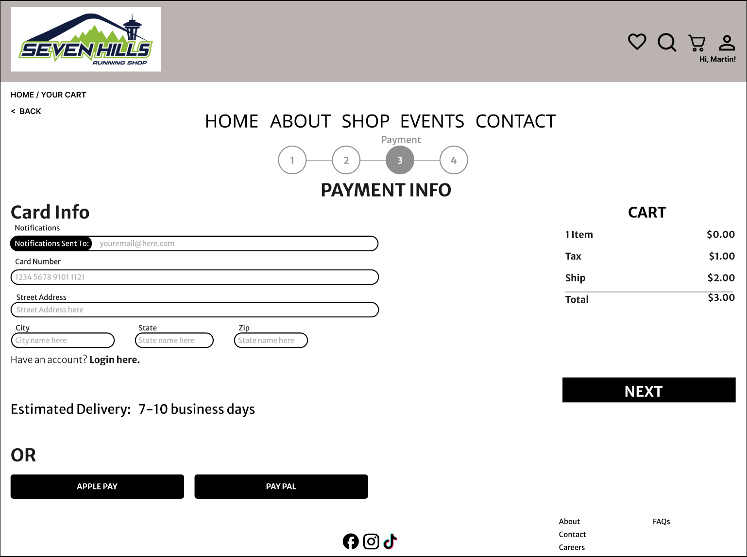
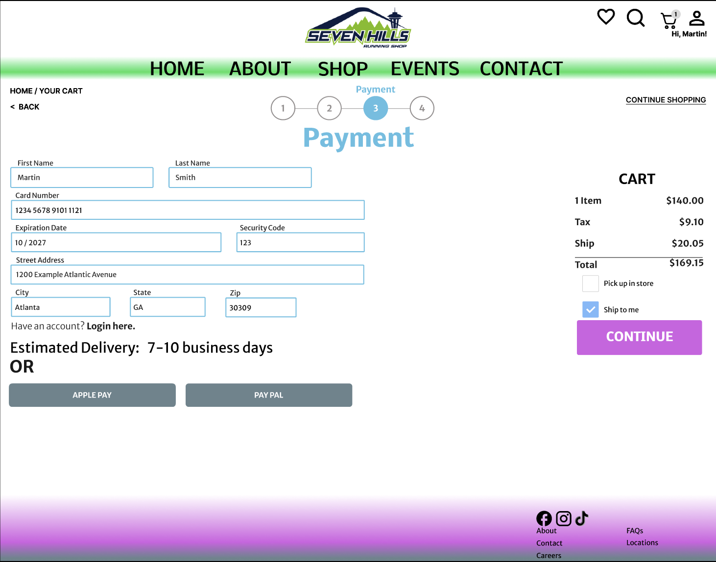
Now that the navigation for the website was updated, I sketched out the pages that I would be creating prototypes for, based on my research. I created a revised home screen, a product information page, a checkout page, payment information page complete with account info, and then a confirmed checkout screen. In my research, a couple users noted there was no status bar to indicate how far along the checkout process was, so I added one for extra intuition. Additionally, I included further annotations around the sketches for edits to include in the first prototype.
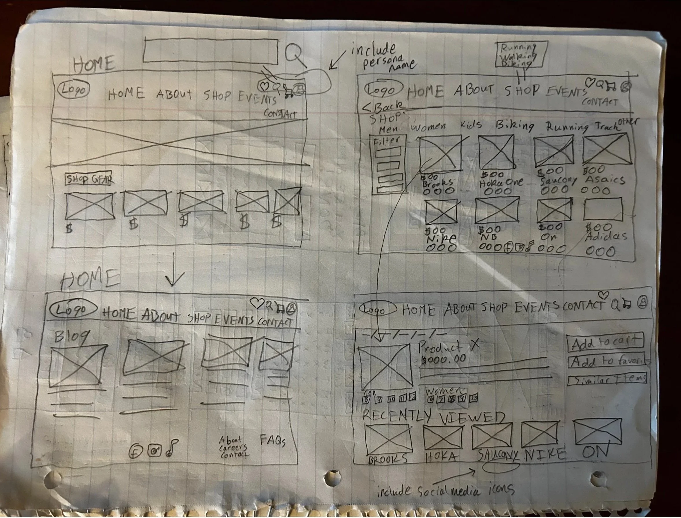
Home screen, shopping screen, product information screen

Bottom of Brooks Ghost screen, shopping cart screen, payment options
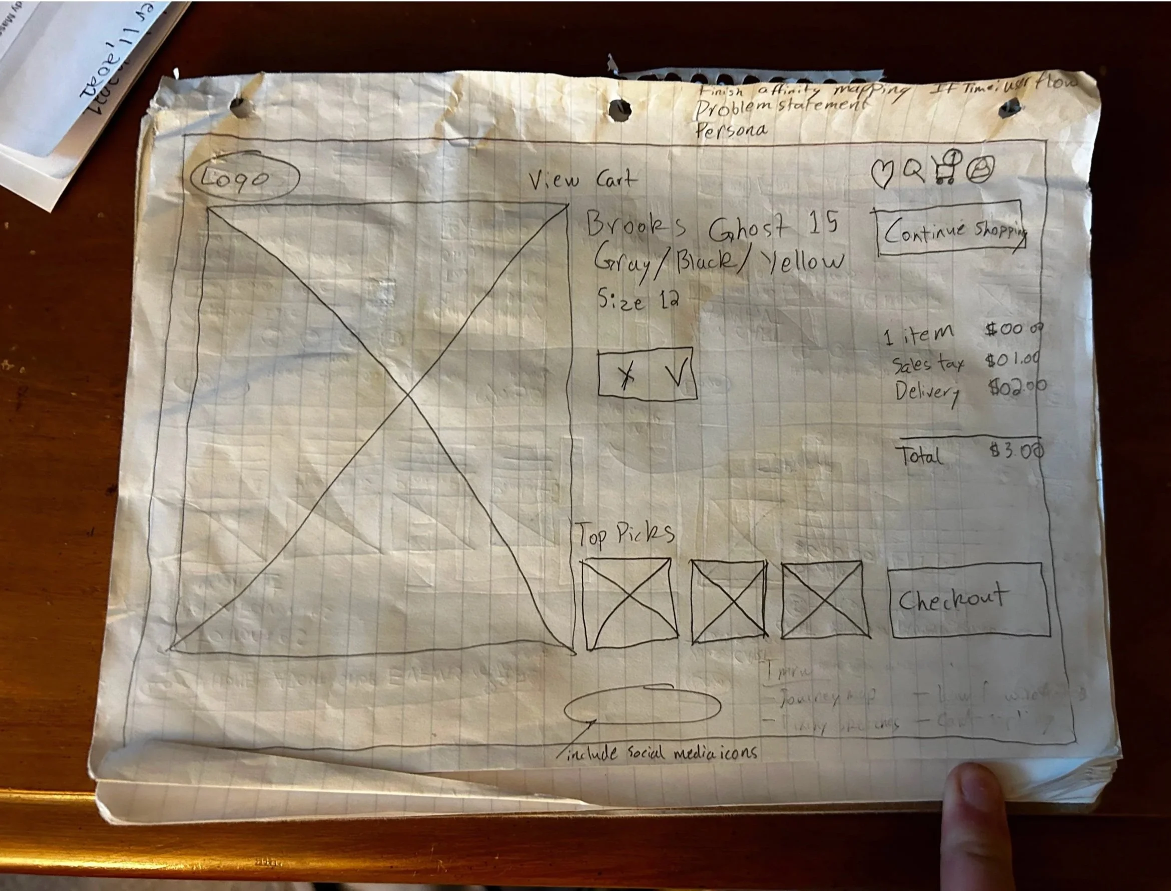
Product screen with a Brooks Ghost 15

Review selection screen, account information screen, and confirmation of checkout
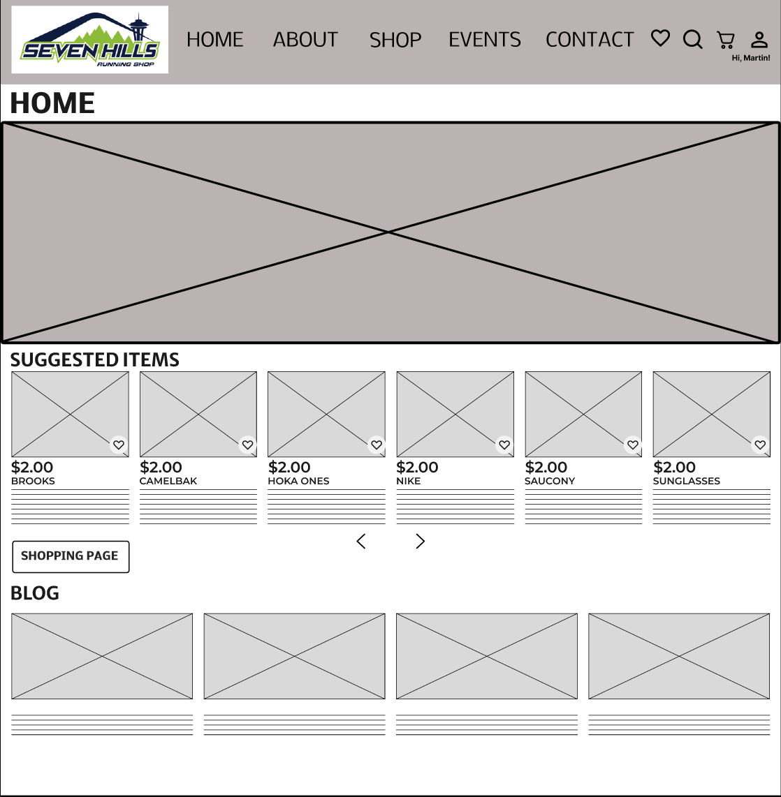
Low-Fidelity Prototype
After the sketches were completed, I started wireframing the redesign for the website, keeping all of the previous data in mind. Since Martin prioritized timeliness and efficiency, I needed to focus on that. I kept the need for intuition and empathy to make sure any runner looking for a new pair of shoes could find exactly what they were looking for. Because of that, I emphasized making the shopping page more organized and customizable so that any future users could easily and efficiently find the shoes they were looking for. Lastly, I made sure to include any changes indicated in the annotations on the sketches.

Following the completion of these wireframes, I conducted a round of usability testing on the new prototype. I interviewed 3 users to test the effectiveness of the design. Based on those interviews, I collected the following data:
Each user completed the prototype in an average time of 6 minutes and 37 seconds
There were a total of 0 / 12 errors made (any misclicks)
The success rate was 3 / 3 users completing the “happy path” in under 8 minutes
The prototype did not provide shoe sizes
Users liked the status bar that became available when arriving onto the final checkout page
Confused by there only being 1 product offered with a complete checkout path
There weren’t any colors besides gray, black, or white
This usability testing was completed with the following considerations in mind:
Assumption: You have bought running shoes online before at a different store.
2nd Assumption: Seven Hills allows you to have an online account
Mid-Fidelity Prototype
With these considerations and data in mind, I moved forward with the second prototype: this one was a set of mid-fidelity wireframes that included the data from the low-fidelity wireframes. Once again, my priority was to make this design as detailed and empathetic as possible. I was able to start adding the modern touches for the redesign during this stage of the project.

Following the completion of these wireframes, I conducted a round of usability testing on the new prototype. I interviewed 3 users to test the effectiveness of the design. Based on those interviews, I collected the following data:
Each user completed the prototype in an average time of 5 minutes and 42 seconds
There were, again, a total of 0 / 12 errors made (any misclicks)
The success rate was 3 / 3 users completing the “happy path” in under 8 minutes
The home page felt very flat and basic, and the font was not professional
Users liked the status bar that became available when arriving onto the final checkout page
The pair of shoes one user wanted wasn’t available to click on
The brand colors were confusing
This usability testing was completed with the following considerations in mind:
Assumption: You have bought running shoes online before at a different store.
2nd Assumption: Seven Hills allows you to have an online account
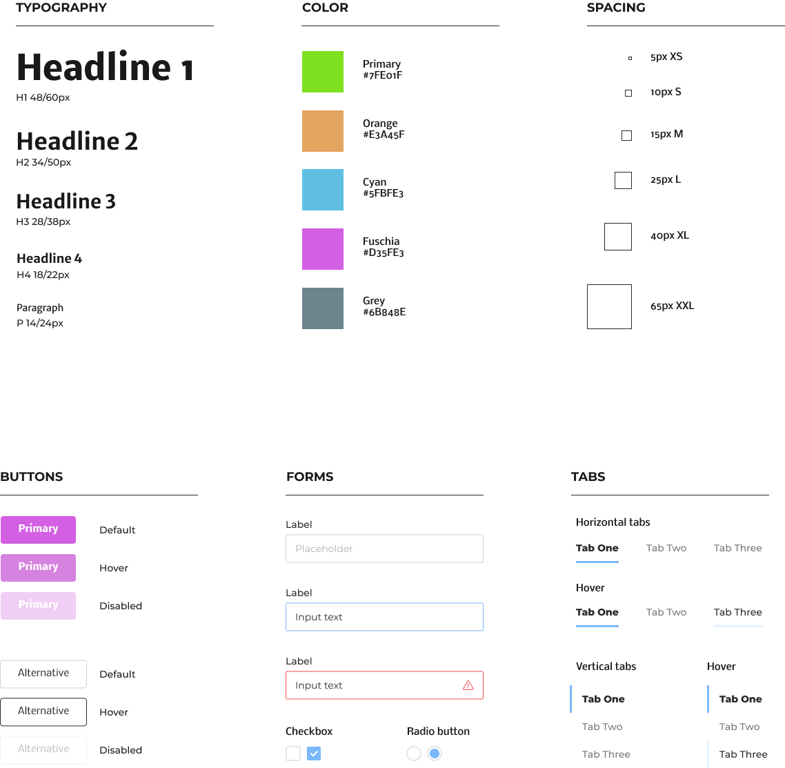
Style Guide
High-Fidelity Prototype
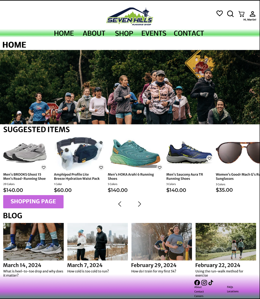
After the recent 3 iterations of the redesign, we have finally arrived at the high-fidelity prototype for the redesign. With the same considerations at play, I added more detail to achieve the sleeker and more modern feel to the website. Minimal animations are included in certain parts of the redesign, and the header/footer are more developed than in previous iterations. I wanted to make sure the font sizes, typefaces, and “happy path” made sense to any user viewing the redesign. Unlike the previous iterations of the design, I did not perform usability testing on this prototype. You can view the final design below!
View Prototype:
Next Steps
As with any project, there are always updates and enhancements that can be made. The next phase, if I do return to this project, would involve usability testing not only on the high-fidelity prototype, but also with real customers to add real touch points. Additional focus on performance, accessibility, and mobile responsiveness will ensure the redesign experience is seamless. I have included the steps I would take should I return to the redesign in the future, listed below.